Case Study
Breaking down YorCMO's website with scientific design
Deddy I
Nov 1, 2024
Hey there! Your website has 3 seconds to leave a good first impression. When you design the wrong way, that 3 seconds can break your business.
Today, I’ll walk you through my redesign of a fractional market service's landing page. You'll find 8 landing page design tips at the bottom. Let's dive in.
Before
I found 6 notable issues on YorCMO's website:
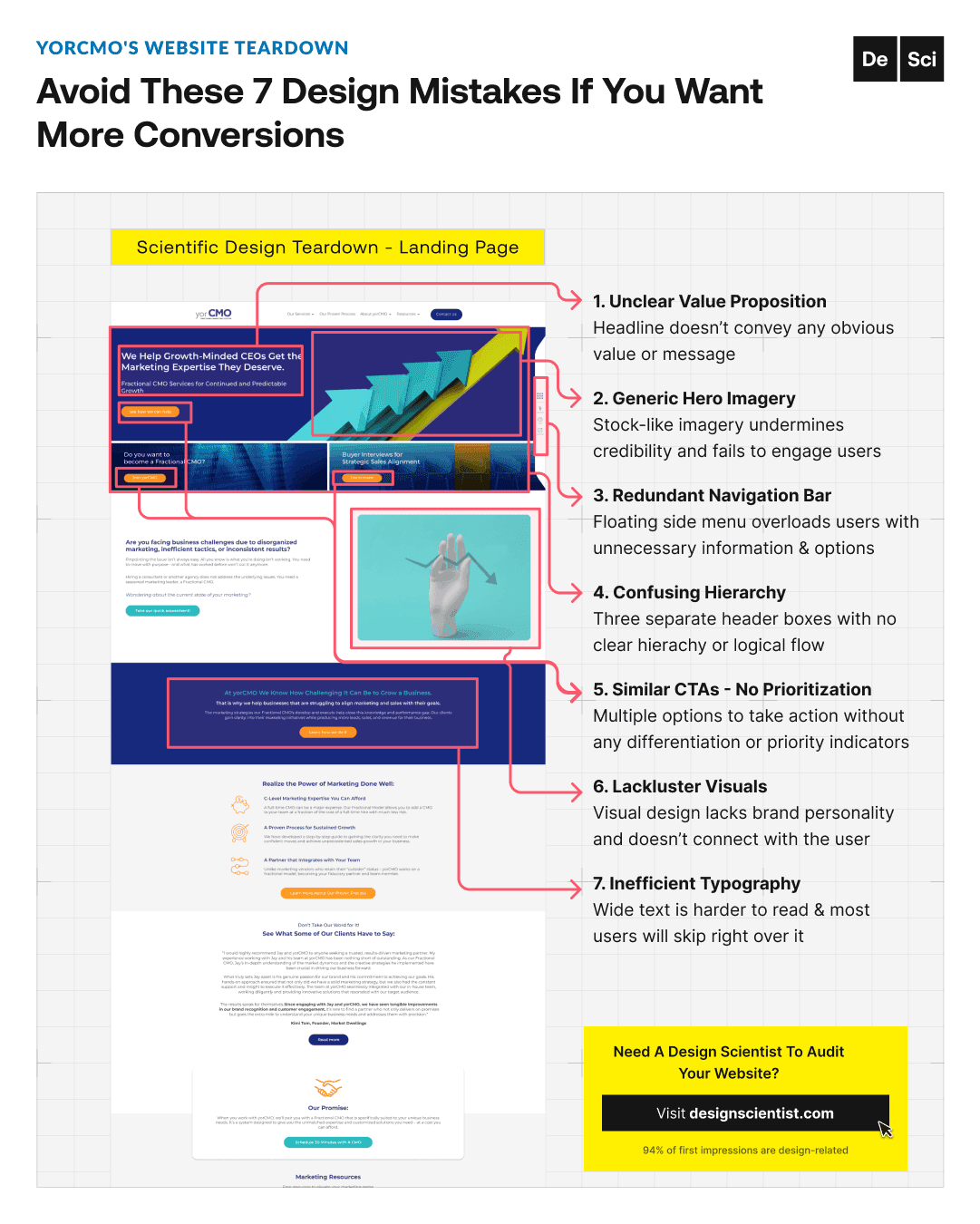
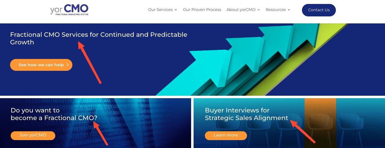
1) The first issue is the unclear value proposition.
The headline should convey an obvious value or message.

2) Generic hero imagery.
Imagery should engage users & reinforce credibility.

3) Confusing hierarchy & page organization.
Separate header boxes should be organized with a clear hierarchy & logical flow.
4) Similar CTAs with no prioritizations.
CTAs should be differentiated with clear indicators like color or style.

5) Visuals lack relevance.
Visual design should connect with the user & showcase brand personality.

6) Crowded, inefficient typography.
Important text should be boxed into columns or bullets so it’s easier to read.

Redesigning
Now that we understand the issues, let's get to the fun part.
After
8 pieces of YorCMO's website that work better redesigned:

1) Clear visual hierarchy
prioritizes separate actions with CTAs differentiated by size, color, & position.
2) Attention-grabbing headline
immediately clarifies the value proposition.

3) Prominent primary CTA
highlights the main action button for easy access.

4) Relevant visuals
match the visual design with the headline & reinforce key outcomes offered.
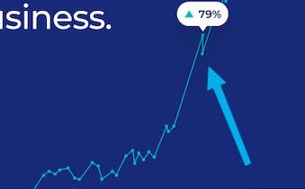
5) An expert showcase
elevates the perception of professionalism & trustworthiness with real people.

6) The credibility badges
build trust & user confidence with verifiable indicators.

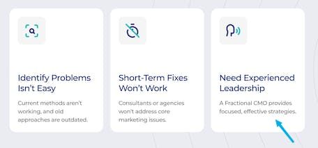
7) The clutter-free elements
simplify informational sections for quick understanding.
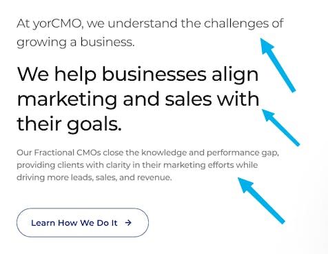
8) A clean text hierarchy
improves readability with organized, compact copy.
TLDR —> 8 landing page design tips to make people stick around:
Clear visual hierarchy
Attention-grabbing headline
Prominent primary CTA
Relevant visuals
Expert showcase
Credibility badges
Clutter-free elements
Clean text hierarchy
I hope these tips are helpful. I'm here to help you see and understand effective design principles and practices. My goal is to inspire you (and your business) with the science of design. Design done different,
The Design Scientist
